Saturday, 26 March 2011

Digital Me: Evaluation


The second project of this term was called ‘Digital Me’; I was set the task to code and design a five page interactive website using Adobe Dreamweaver. The purpose of the website was to act as a digital portfolio and promotional online resource for my University work. I had to display proficient design principles, learn to self-promote and gain an imperative understanding of coding and building a website. Consequently, I had to show a fundamental insight and true concept of the current common attraction to utilising social networking sites as a form of advertising and displaying information.

Firstly, I drew up wireframes so I could begin to explore and interpret initial ideas for my website design. Secondly, I began to investigate and learn about Adobe Dreamweaver; this was the software that I would be using to code my website. Primarily, it took me while to learn how the software and HTML worked. This proved to be far more challenging than last terms project, 'Interactive Space'. However, with much patience and guidance from my lecturers in seminars and also extensive online research, I gradually began to grasp and to successfully apply the software. Finally, I managed to build the basic template that I had predesigned using the wireframes as a guideline.

Once I had the basic template, the actual design of the website had to be decided. This included deciding on which font, logo and colour schemes I wished to portray on my website. It was a lengthy process to compose a name for my site that I could base my logo on as this was an important decision as I felt passionately about making the website reflect my personality. I spent time mind mapping and experimenting with possible ideas until I had the concept of my final choice: ‘I-Scream Design’. I scanned this image into Photoshop, where I then traced the image and added colour in an original way. I used muted bright colour’s to reflect my personality throughout the site; cheery and loud, but with a sense of calm and tranquility. I then moved and used the logo to design the banner. To achieve this, I downloaded two fonts from dafont.com and inserted my logo; again this was all completed in Photoshop.

I believe the most successful components of my site were the colour choice that I used; they all complemented one another and provided direction through all the pages. I had to edit the gallery’s XML so the font and colour’s followed with the rest of the site; these allowed a pleasing flow for an audience as they travel between pages. I also felt the unique features I included, such as the contact form and the redirection of the page after form submission, brought a professional atmosphere and quality to the site.

On the contrary, time and skill permitting, there are many improvements that I would like to have made to the site. Majority of these improvements would require me to know JavaScript, however, I believe they would have added to the sites content and overall design. I would have liked to have added a Facebook feed and possibly change the main font I used, as I do not feel it harmonised with the rest of the site.

Having now completed the project, I can conclude to the vast knowledge I have gained throughout the designing of my website. From knowing very little about HTML and Adobe Dreamweaver, I am now confident I have a reasonable understanding of coding and am suitably capable to build a functioning and aesthetically pleasing website. On completion of the project, I have been left questioning which pathway I wish to follow next year as I enjoyed exploring new software leading up to the creation of a functioning and gratifying website.


Thursday, 24 March 2011

Digital Me: Website

Here are screenshots of all the webpages I have designed,  I hope these images give you an insight to what my actual webpage looks like. I will write a 500 word evaluation which I will upload shortly.


Home


About


Portfolio


Gallery


Videos


Contact


Thank you

Digital Me: Social Network Icons

Below are the 3 Social Networking icons I wish to use for my site, however the icons below are ones I have edited for my website. However, I do not think they work, as they do not stand out on the page and they are not as recognisable as the actual social networking site's. I have decided to use icon's I have found from a website called Icon Archive, I have used hotspots to link them to my pages.


 Facebook


Twitter


Blogger

Digital Me: Banner

The next stage for the design of my website was to design a banner that can be inserted into the header of the site. This meant finding the correct font that I want to use as well as including the logo somewhere within it. I decided to create a number of banner's and then from this choose which want I will choose for the site.


The above banner is one that I do not want to use as I don't like the positioning of the logos or the colour of the font, I also feel that I that two font's could make it more aesthetically pleasing. 


This banner is better and the improvements from the above banner have been made, however I am still not happy with the positioning of the logo and I want the font to be larger as there is too much blank space.


For this banner I enlarged the font and used the logo as the dot above the 'I' this does not work as the logo is too small also the font for 'design' needs to be enlarged.


This is the final banner I wish to use as I feel that the font's work well together and enlarging the logo and only using a section work's aesthetically with the rest of the site.

Digital Me: Logo

Once I had decided on a layout, I wanted to come up with a name and a logo to design my website around. At first I drew many images of different object's until ended up with this ice cream in a glass with a straw and a cherry on top as seen below. This is a sketch of the logo that I plan to use in my website, I would like to make a few alterations but this is the basic logo I would like to use.


The next step I took was to scan the above image into photoshop where I used the variety of tools to trace over the sketch and then add colour. The colours I have used are faint but bright colours as I wished to show my bright and cheerful personality through my website. I didn't keep the colours in the lines as I wanted to have a tissue paper type effect. The image below is the final logo I want to use for my site.

Saturday, 12 March 2011

Digital Me: The Wireframe For My Website

Here is my initial layout designs I produced in Adobe Illustrator, there is a possibility however, that the designs may be altered as I am coding my website because I am sure that there will be complications in my design or improvements that I would like to make.


1
2
3
4
5

Thursday, 24 February 2011

Digital Me: Research

I decided that I needed some inspiration for my website so I did some research online. I searched for interesting designs, each using different layouts. Here a few screenshots from the pages that I liked, I have also included links below each screenshot so that you can have a look and see exactly why I enjoyed each site:


This webpage is quite simple but I like the layout, from the positioning of the navigation bar on the left to the title of the page itself. 

I like this page as I believe that it interacts with the user very well, it's exciting to play around with, but slightly harder to navigate around than the webpage above.


I also feel that this webpage interacts well with the user. I like how you can scroll from the left to the right, travelling through their 3 albums in order of there release as if you were going through time with the band. This page was also designed using HTML 5 which is the latest version of HTML.

New Project: Digital Me

We have been set a new project called 'Design Me' where we have to design a website based around ourselves and our personality. We have gone straight into the project, learning HTML code and laying down the basic layout of our webpage. The first bit of work we have been set is to put together a moodboard about anything that we like including TV programmes, bands and fonts that we could include within our site. Here below is an image of the moodboard I put together:


Friday, 18 February 2011

Evaluation Of Our Groups Film: Dog Life


This term we were divided into groups in which each would receive a different script to produce. The aim of the project was to utilise our creativity and originality  in order to develop the script in our own way. My group was given ‘Dog’; initially, we found the story to be extremely outlandish. However, given thought we realised that we could make this film exciting, humorous and interesting. Since I was given the responsibility of Filming and Lighting, my preliminary thoughts were directed to the different camera angles we could use and lighting that would be needed to set each the scene. Moreover, I was forced to consider the time span of the film, whether it take place during the night or day.

During the first three weeks, we began planning; research was conducted as well as formulating a necessary risk assessments. Props were brought in addition to locations identified. As a storyboard was drawn up detailing our exact filming schedule, we invested in an actor to part-take. The original script was about a man who eats dog food, takes ‘a difficult shit’ as he gradually forms the characteristics of a dog. After reading the script, we decided to give the film a ‘comic’ tone as this is the genre we found fit the script best.

We were excited to shoot the film as we had some innovative ideas and wanted to trail their success.  However, we soon faced a problem when an actor was unable to attend; we realised it was hard to rely on other students and trying to fit around their university schedules, therefore we resorted to employing a member of our own group to be in the film itself.  Although he had no acting experience, he knew exactly what persona we looking for. Despite this, I still do not feel this worked to our advantage as he was unable to aid the rest of the group in filming.

I felt my role i was successful; the multiple different angle shots I suggested for each scene looked effective in the final film. It allowed the editor to do a number of cut edits to keep the flow of action constant and entertaining for the viewer. There were a number of issues I had with the camera, such as focus and white balance. This forced us to re-shoot a number of shots, but after mending the settings it allowed us to film smoothly with no mistakes. Nevertheless, I do not feel the lighting was as successful; in one the scenes near the end of the film, there were solid black shadows making a stark contrast to previous scenes. Time permitting, I would of fixed this lighting problem and reshot this scene. Feedback played a huge role in allowing us to refine and develop our film once we had edited a first cut; by uploading it to YouTube, we were able to receive feedback from a wide audience who commented on both the sound and lighting. This constructive critism was beneficial in allowing an audience to give us accurate developments in order to improve our film.

Overall, I felt that for a first attempt at a ‘Short Film’ our final outcome was quite reasonable; it fulfils all our aims set at the beginning of the project. I believe that the different camera angles give the film a diverse and realistic atmosphere as it allows the audience to comprehend the life of this unusual human being. In hindsight, I feel I was not as prepared with imagining exactly how the lighting will look; in future projects I will spend more time predetermining the complete vision of the scene. Furthermore, I believe the use of a more skilled actor would have added to the quality of the film. Another setback we encountered over the five week period was the lack of attendance of members of our group to seminars. This caused us to have a lack of communication. We did however get around this problem by the use of a Facebook group which worked quite effectively. Collectively, I have learnt a number of things while shooting. The most significant being the impact of small changes which can dramatically affect entire scenes and the overall affect of the film. Errors with lighting, costume design and camera settings can all have considerable and distracting influences on the audience. The most vital knowledge I can take away from this project is a sound understanding of the design process when shooting a film. In conclusion, I enjoyed this project thoroughly and it has forced me to rethink about what pathway I would like to follow next year. Below is a link to our film:

http://vimeo.com/20077304

Tuesday, 15 February 2011

6 Men and a Camera Present...DOG LIFE

Here is our final edited version of our film, Dog. I will upload a 500 word evaluation in the next few days but for now I hope you enjoy our film because it was enjoyable to make. 

Dog Life - My First Short Film from George Pickles on Vimeo.

First Draft Edit: Dog

Yesterday, we finished shooting and Tom started immediately editing the hundreds of clips we shot to produce this first edit, there is quite a lot of sound missing and a few changes to be made concerning the length of certain shots but this will give the you the basic idea of what we were aiming for. It's meant to be a bit of a comedy as we were given such a strange script. We have received lots of feedback on YouTube which was mainly positive but anymore would be greatly appreciated. We hope you enjoy what we have produced so far and the final edit will be up shortly.

Researching: Dog

I was researching initial idea on YouTube for films about dogs to further inspire me; I came across another version of the same script we have been given but by past first year Trent students. Some are very similar to our groups but I believe we are going to make them look better by using more refined camera angles, scenes and by detailed editing of the film, hopefully making it feel more realistic. In particular, the use of sound effects will promote the films success. In this film, I found the lighting effective and I enjoyed the acting; I thought he did a fantastic job at portraying a dog-like character. Here below is their film, enjoy!

The Shoot So Far: Dog

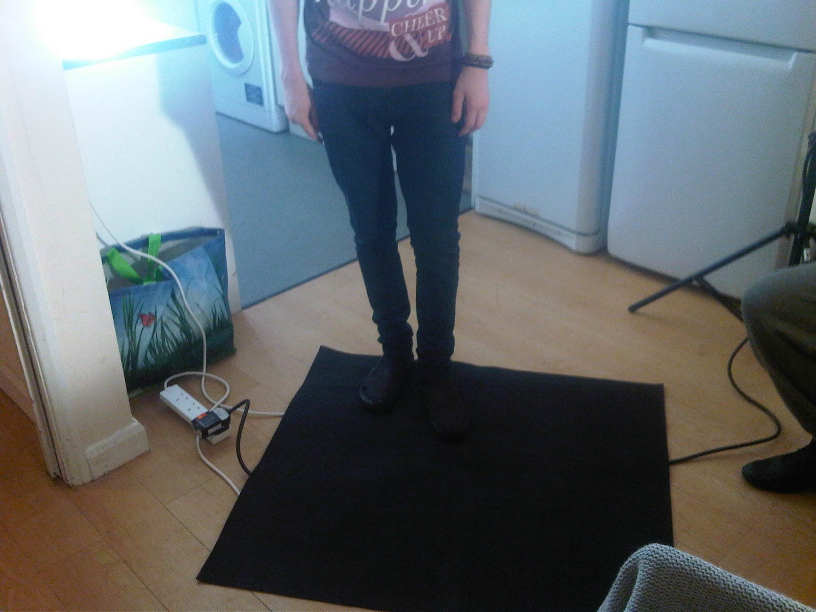
Today, we started shooting our film. However, the actor we had asked to be part take was no longer available, so our back up actor, Jordan who is a member of our team was utilised at short notice. The set up of the equipment and scenery went well; all health and safety precautions were put in place as shown in the pictures below. We noticed a few problems immediately to do with lighting, space and communication within the team. Once these problems were dealt with, we managed to film all the kitchen/landing scenes. Tom had a play with the edit using Adobe Premier Pro to give us all an insight of what the finished product could look like, which is also shown below.

The Set:


The First Test Edit:

Monday, 14 February 2011

The Plan: Dog

We have constructed a plan for the short film we have been given about a dog. We have each been given a responsibility; mine is to be in charge of the lighting and camera. Therefore, I will set up the lights to the create the correct lighting for the shoot as well as making sure the camera settings are correct so we make no mistakes as we film. We have chosen our locations, actor and bought all the necessary props we will need. The next stage was to draw up the storyboards including a written storyboard (as shown below) and to write up the risk assessments. We have now been given the all clear to film by our Lecturer, I am keen to start filming and will hopefully will be able to upload short preview clips soon.


Written Storyboard:


  1. INT . KITCHEN . DAY

Cupboard doors are flung open and rapidly slammed as the cupboards are revealed as empty. Eventually….. one cupboard is opened and shut quickly and then re-opened. We see inside. There is a dog bowl, and a tin of dog food. [Freeze frame]

Man (V/O)

Ordinarily I wouldn’t have considered it but…….

Camera will be in the cupboard in darkness, the doors open to revel the mans face looking in. He will look disappointed for the first 4 cupboards, then face lights up as he opens the fifth. The camera will be half blocked by a tin of dog food, then a reverse shot from the mans perspective of the dog food and dog bowl on the bottom shelf.

INT . KITCHEN . DAY

The plate of dog food sits on the table . The knife and fork are straightened to become perfectly aligned.
The man gently drops a sprig of parsley onto the dog food.
He picks up the knife and fork and stares at the plate.

Directly above view just shows the dog food and cutlery on the table at first, no arms. One arm comes in to straighten the cutlery, and place the parsley sprig. Both arms then pick up the cutlery, scene cut.
  1. INT . LANDING . DAY

From outside the toilet we hear a difficult shit taking place.

Focus on the toilet door, sounds of a difficult shit, and cut to a clock which winds forwards 3 hours, then seeing the toilet flush and the door begin to open.
  1. EXT . STREET . DAY

Our man is walking down the street. He has a distinct, pronounced spring in his step.

Our man will be walking down the street whistling to himself, smile on.

  1. EXT . STREET . DAY

We see our man sitting in a café. He is talking ten to the dozen.

We will be using the student union café (costa part) and have our man speaking really fast and not really making much sense. ( Mr.Bean style)

  1. INT . KITCHEN . DAY

Our man unloads his shopping. Tins and tins of dog food, plus some herbs and milk.

We are going to have the camera in the shopping bag, looking up the mans arm towards his face, trying to portray that it is part of the shopping, then we will see the bag being put down on the table, and the camera will be unpacked and put on the table with the cans of dog food, like it is a can of dog food.

  1. INT . KITCHEN . DAY

What follows is a montage of a series of jump cuts as plates of dog food are eaten, piled up, eaten, plates clean, knife and fork switching sides and spoon and fork. Different plates. Each time a sprig of parsley is left on the plate uneaten, sometimes the plate is a bowl.

  1. INT . LANDING . DAY

From outside the toilet, we hear a difficult shit taking place. It is so difficult our man is still trying to defecate as day turns into night.

We see our man going into the toilet, then we have a shot of out the window, but still with the sound of the man trying to shit. Day turns to night, and then we go back to seeing our man leave the toilet.

  1. EXT . PARK . DAY

Our man studies a pile of dog shit. Slowly he stands and shuffles off, almost under his breath we hear him growl

Filmed from dog shit perspective , very close up shot, just see a nose drop into shot from the top of the frame

  1. INT . FRONT ROOM . NIGHT

Our man sits and watches television, picking up his glass of water he begins to lap it up with this tongue.

Very dark scene, using the television light to flicker different amount s of light onto the characters face. Extreme close up when he laps up the water.

  1. INT . KITCHEN . DAY

Our man slowly spoons dog food onto his plate, the plate is maller than any we have seen before

We will shoot this with exactly the same view as with the bigger plate, so that the plate is noticeably smaller.

  1. INT . KITCHEN . DAY

Sitting at the table our man slowly, reluctantly eats the dog food, as he turns to eat, tears run down his face.

Shot from the opposite persons view so you are looking straight at him, the camera switches between that persons view and an extreme close up of the character chewing.

  1. INT . FRONT ROOM . NIGHT

Our man runs around in a very tight circle, He is trying to see his back, as he runs he barks.

Filmed through the window, a shot for a woman walking her dog and noticing the strange behaviour so come to peek through the window and we get he point of view shot.

Visual Storyboards:


1
2
3
 4

Friday, 21 January 2011

Term Two

As 2011 has begun, I have been back  for nearly two weeks; here is a brief update of what we have been up to and what I have to look forward to over the next term.
Firstly, I will be studying Film in which we will work in a group of six to produce a short 3 minute film. My group were given a script about a man who eat's dog food and has developed dog characteristics. I am excited about this project as we have many creative and original ideas including camera angles, lighting, sound and the characters we would like to use.
As well as this current project, I also have another Animation and Interactive Space project which we have five weeks to complete.
Moreover, I attended a trip to London where we went to three different museums; The Science Museum, V&A and The Natural History Museum to help us with our Visual Essay which we will have to produce by the end of term 3. This essay must show distinct and focussed direction of topics I would like to study for Years 2 and 3.
I look forward to showing you the work I produce this term and hopefully I will have improved since term 1 as my skills and knowledge have grown. Enjoy!

Wednesday, 8 December 2010

Animation: SpotOn TV


Animation: SpotOn TV from George Pickles on Vimeo.
This is my first attempt at an Animation using 3DS Max Software. At first I struggled to get to grips with the software itself, I spent many hours practising until I finally managed to produce this. I had a few problems trying to get the correct sound clips to go along with it but I made the best of what I had and I believe this is the best outcome. I am pleased with it, however there are changes and improvements I would like to of done. I hope you like it and fingers crossed my next animation will be better than this one. 

Tuesday, 7 December 2010

2nd Attempt at a One Shot Film: Tension


One Shot Film: Tension from George Pickles on Vimeo.
Here is our second attempt at One Shot film. We decided to do another shot as we wanted to try and produce a film with less mistakes than the last one, 'Was it worth it?' and just simply to gain more experience with the camera, lighting and Adobe Premiere Pro editing software. The idea behind the shoot is that as the camera circulates the two people as the tension builds, until one of the characters can no longer keep there anger under control and reacts in a physical way. I hope you like it.

Sunday, 5 December 2010

An Inspiring Lecturer's, Last Lecture


Here is a video I found online, the Lecturer gives an inspiring lecture on life lessons where he shows his strength, wisdom and compassion for his work, family and friends as he is slowly dying from Pancreatic Cancer. I feel that it relates to the the virtual world I have been producing over the last three weeks in my Animation Seminar's as well as the presentation I have to give this coming week. 

I feel that I can relate this to my work and skills outside of the studio in the way that it gives me a lot of strength and hope for the future as long as you make the most of the opportunities that you have been given and that the 'brick walls are there to show our dedication'.